Category Archives: Uncategorized

A visual review of iOS 7 on an iPad Mini

Apple has done a complete visual redesign of iOS 7. Here is my pictorial review.

20130922-202031.jpg

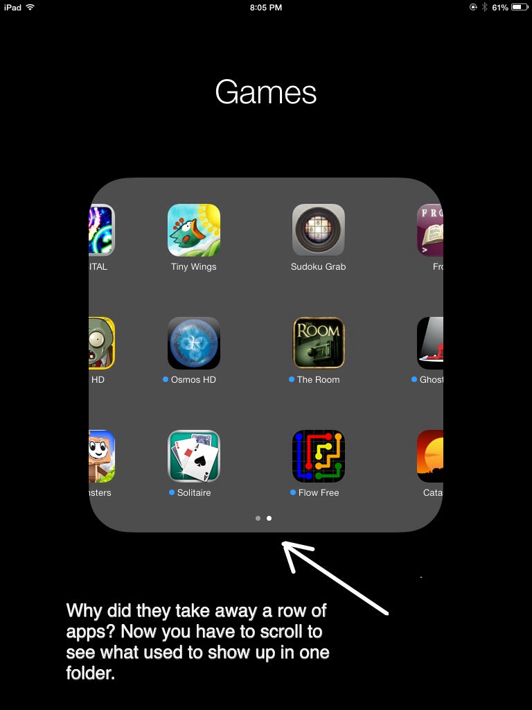
Apple changed the number of app icons that can be seen in one screen.

20130922-172248.jpg

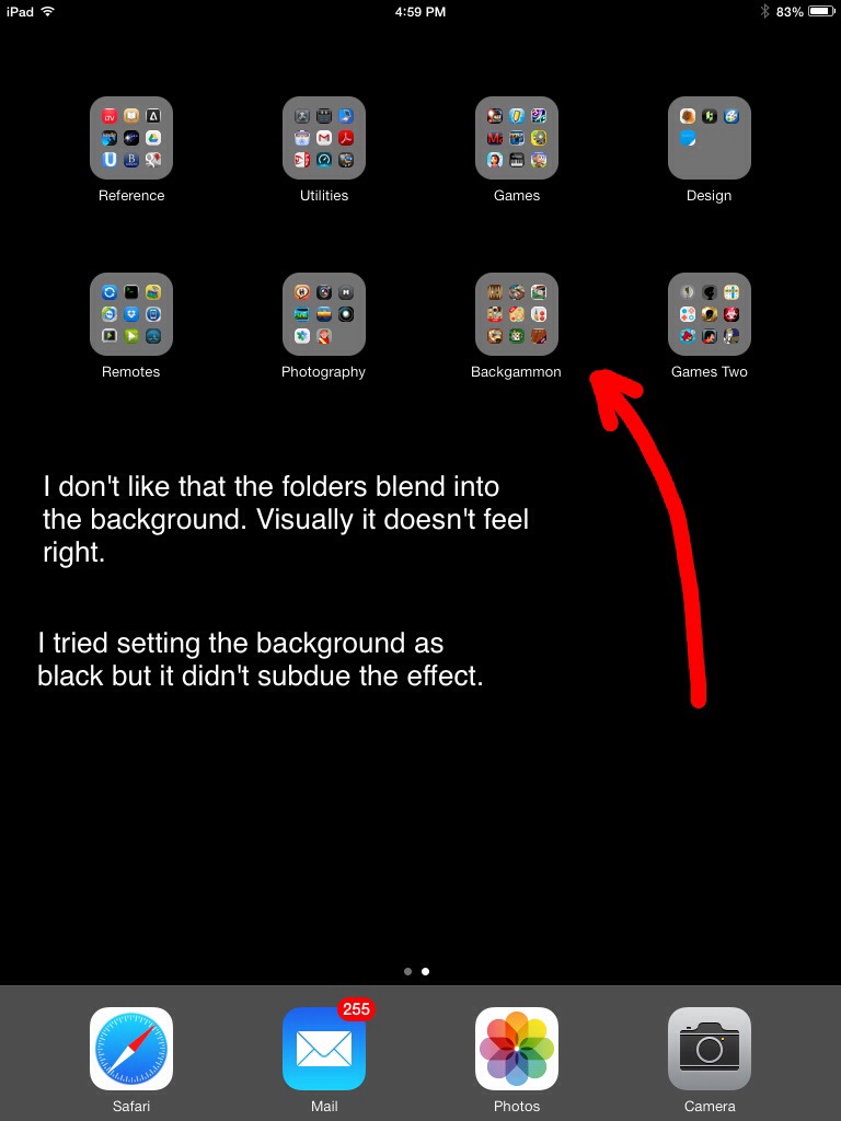
Without a defined border around the folders this just looks weird to me.

20130922-172930.jpg

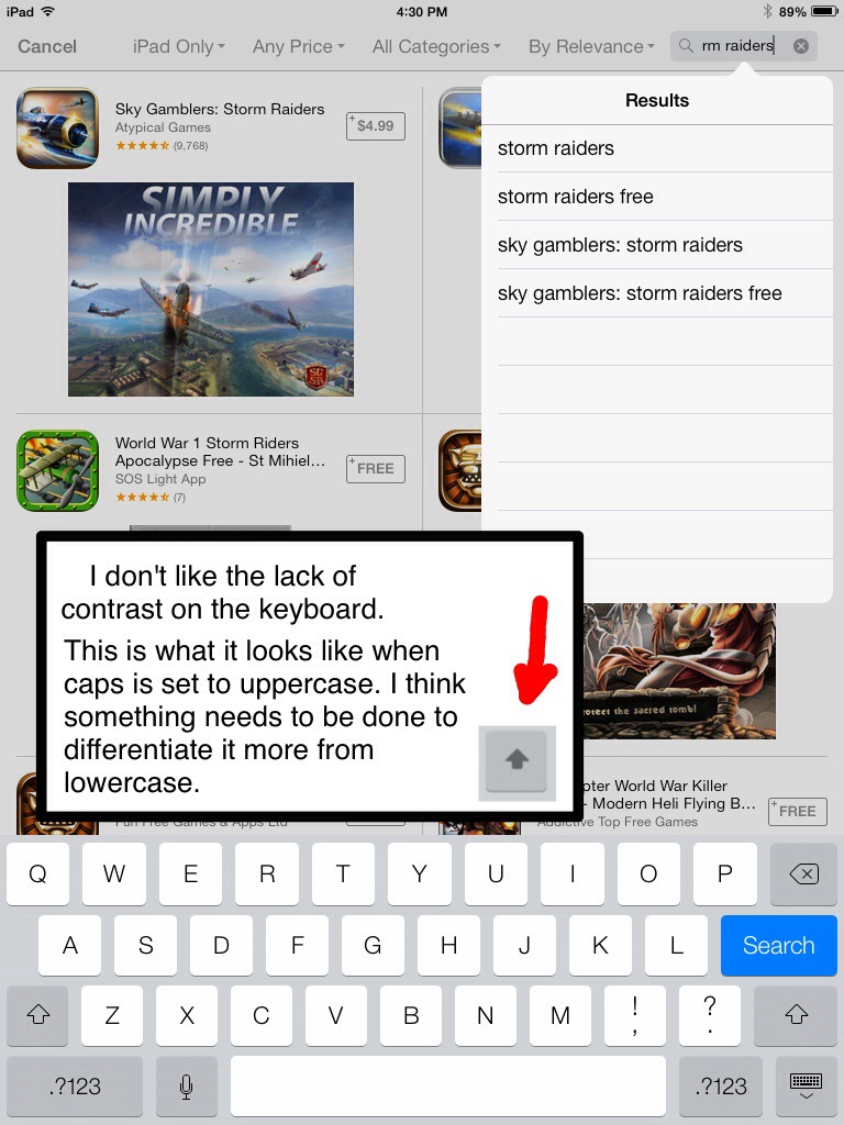
I know… these days visual design is flat and awesome, but it feels cold and lacks contrast.

20130922-173710.jpg

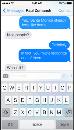
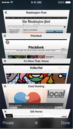
The navigation of safari has always been a pain for me, things are just too small and difficult to accurately tap on. I just realized the hidden x is by design. Since the text is highlighted any key will erase it. My fiance thinks that having the active tab darker is visually confusing. She thinks the active tab should be light and the others dark.

20130929-154113.jpg
The design in some places is a mess.

20130922-174812.jpg

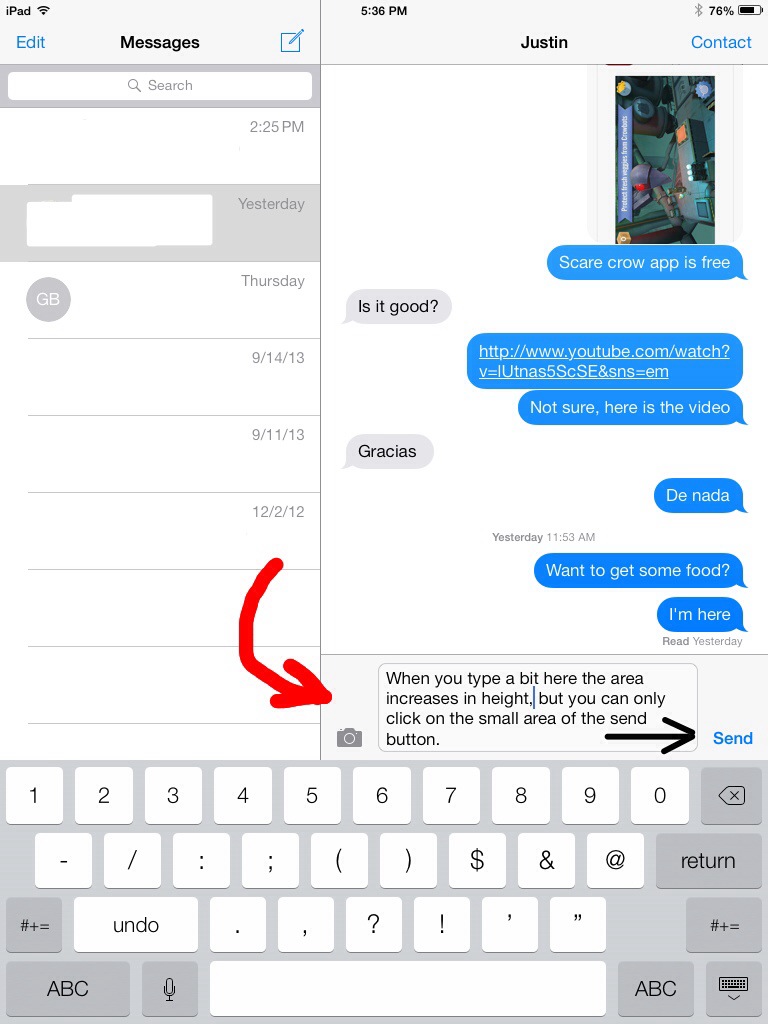
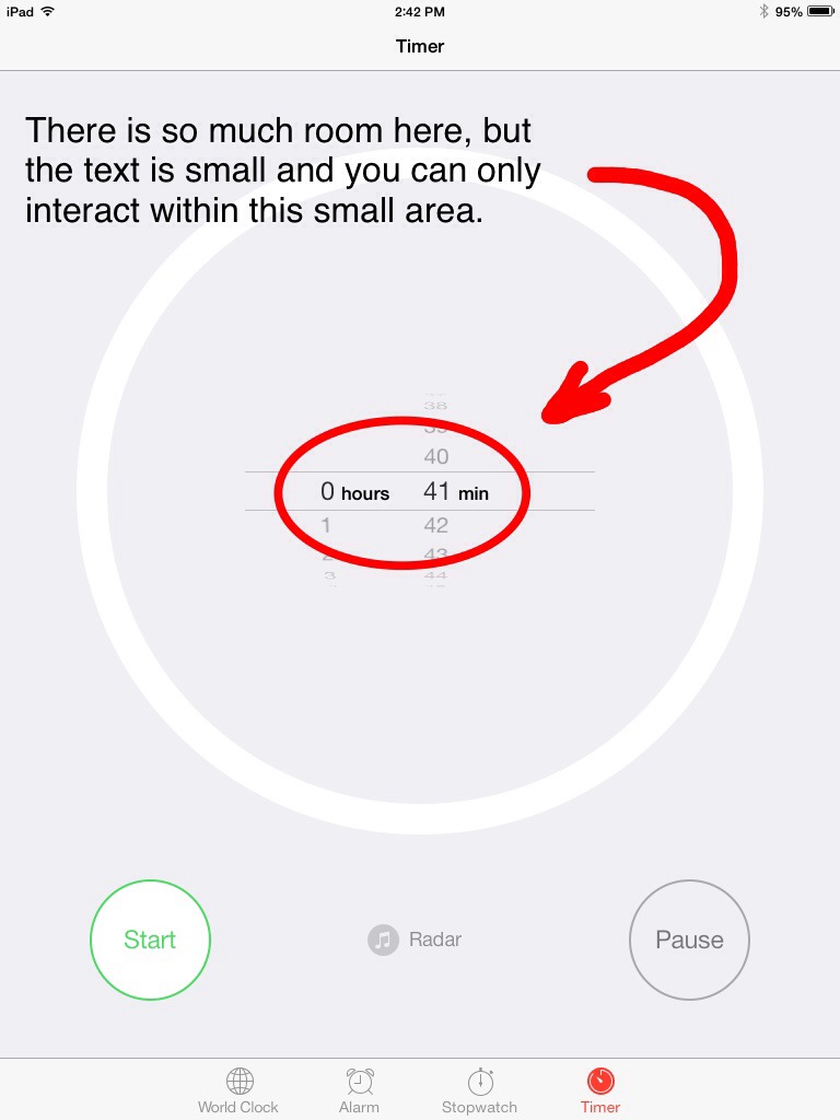
A perfect example of the flat white featureless design. I find that the clickable areas are too damn small sometimes. I hate struggling to tap or find an element.

20130922-180256.jpg

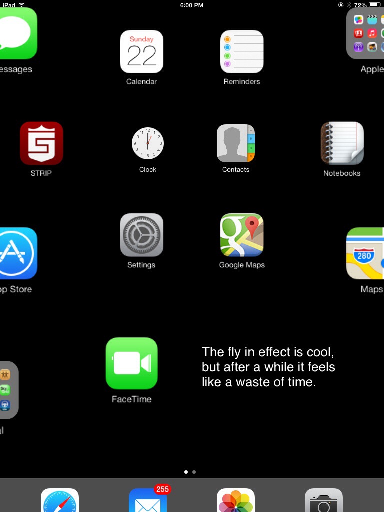
The fly in effect is only cute for so long.

20130922-191954.jpg

Here is an example of a dark vs light design. I actually prefer the darker one.

20130922-193047.jpg

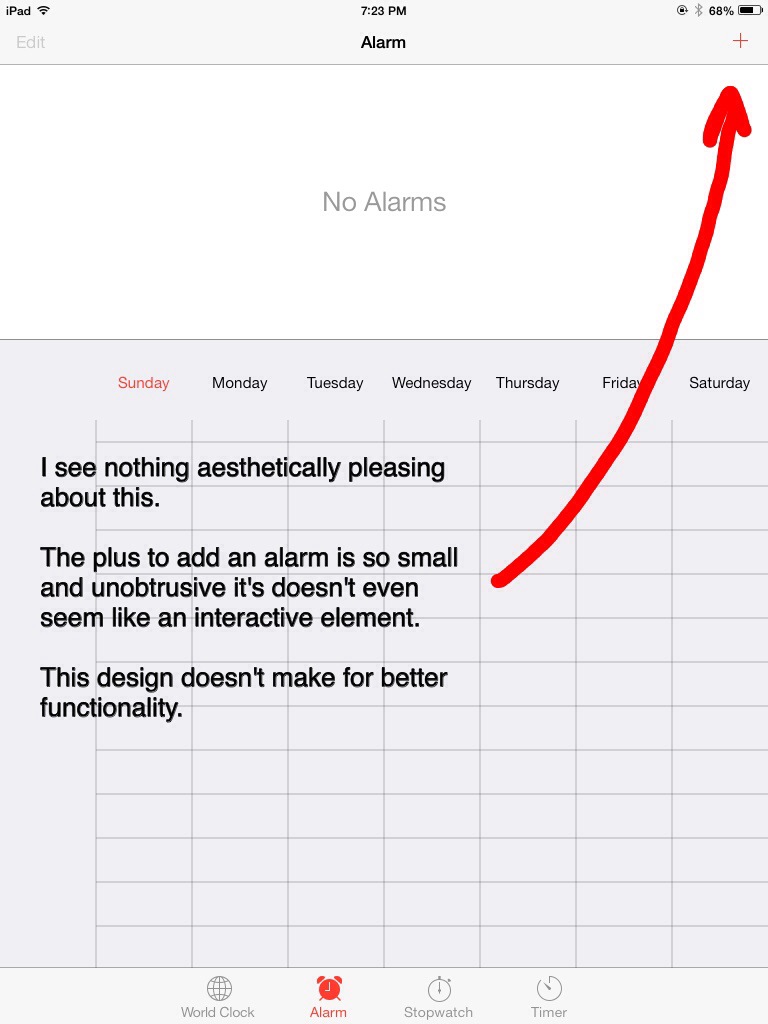
This is just plain ugly and sterile. People that have difficulty seeing or that have aging vision will have a very hard time with the navigation here.

20130922-214507.jpg

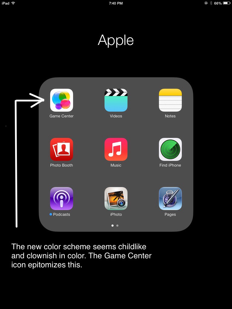
I think the color scheme is questionable.

20130929-155102.jpg

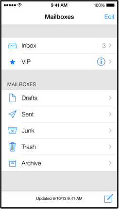
This design and use of space works better on an iPhone.

What I do like about the new design.

20130922-205152.jpg

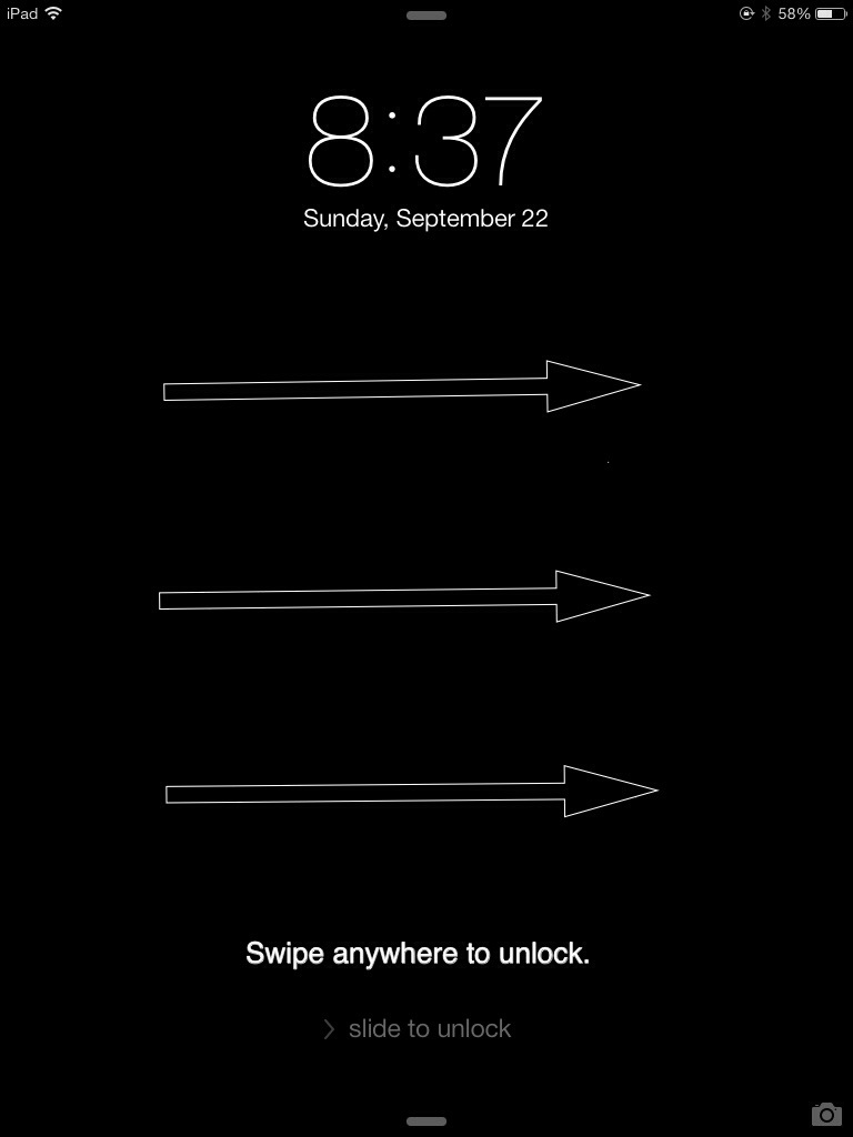
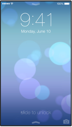
I like that you can swipe anywhere on the lock screen to unlock the iPad. For some reason I’ve often been swiping the wrong way.

20130922-204311.jpg

I love how app switching works now. It’s easer to go between apps, and it’s great fun to close down apps by swiping up on them.

20130922-212745.jpg

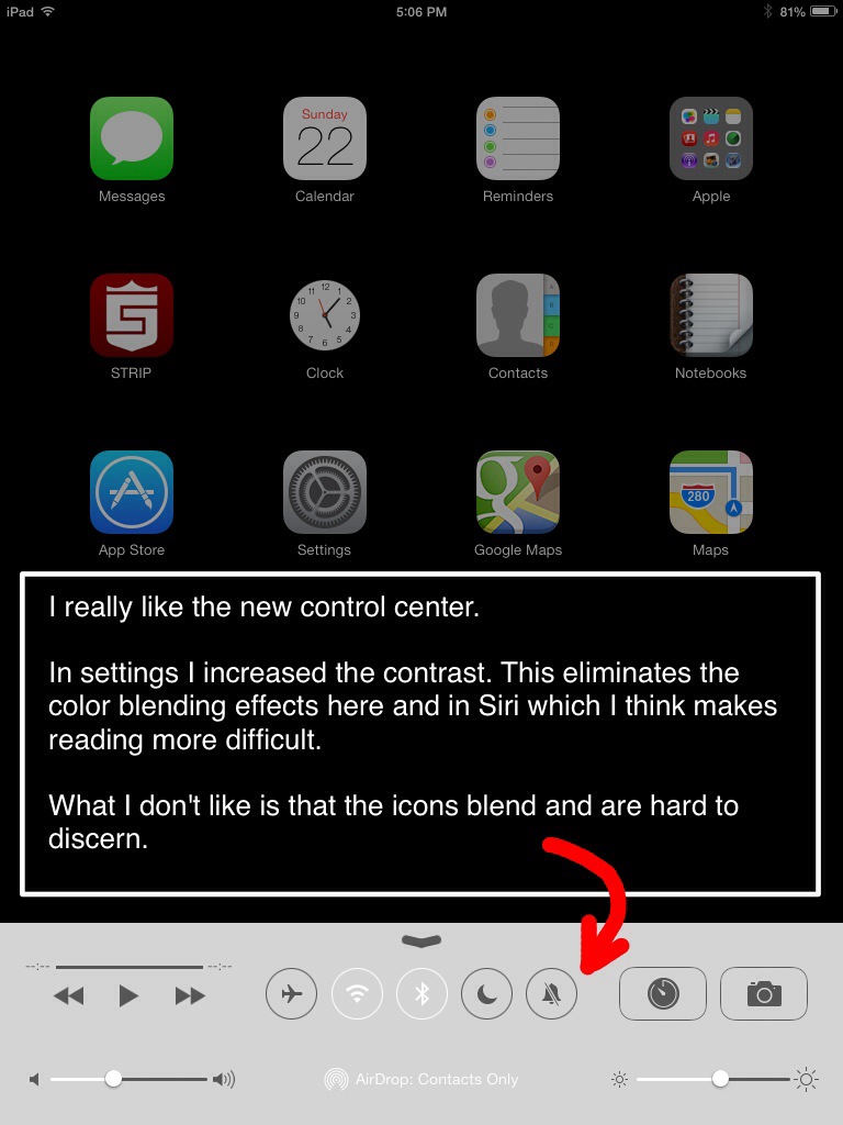
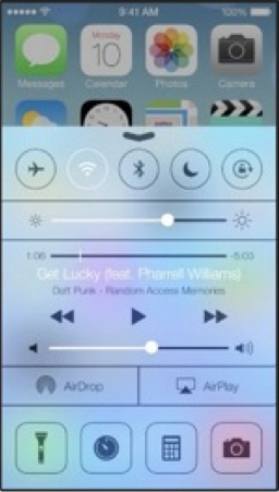
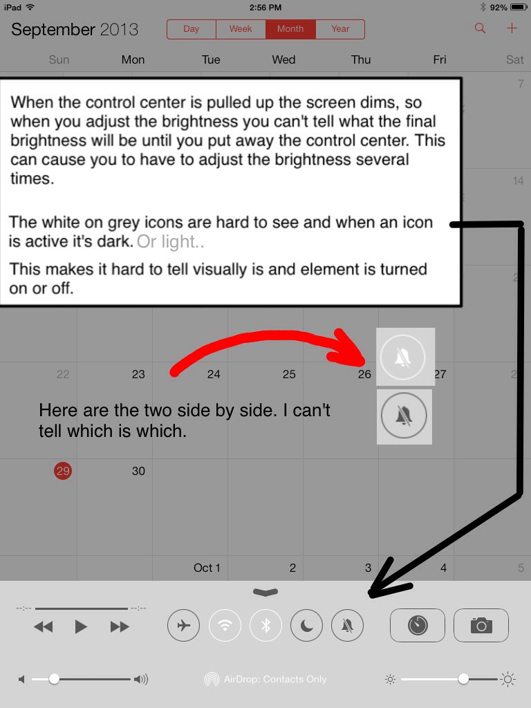
The new Control Center is a very nice addition. I’d like to be able to change which icons are listed. It’s also hard to tell if a setting is active because it goes from an outline icon to solid. Every time I have to figure out if the solid means it’s off or on.

The new design might actually look better if it was black. As far as battery life goes, I think it takes more energy to render a light design as opposed to a dark one.

In general I’m disappointed with the new look, but as far as a mobile platform goes Apple (iOS) is still the best. Under the hood is the best computer engineering out there. The basic functionality of iOS is still amazing and solid. I know that Apple must have some of the best developers around. Included with any Apple product is the app store which in my opinion is the best most diverse purchasing ecosystem right now.

So, yes the new paint job I don’t like but, it’s just a paint job, the core of the system still has good bones and I don’t have any plans to switch to anything else

iOS 7, visually a confusing design

iOS 7 review with screen shots

Apple has made a major change to iOS, here’s the break down.

lock_screen

It features a harder to read clock on the lock screen. Apple is using a new line art font, similar to windows phones. Where is the consideration for people with aging vision? Also, why is the slide to unlock so hard to see?


navigation

The navigation button above apps is now just text and a less than symbol. It’s not a distinguishable button anymore. People are going to be confused by this. I can guarantee you that my mom will think you can only click on the less than symbol in the corner. “No mom, you don’t have to struggle to click that small thing in the corner, you can click on the word too”.


mailThe white on white blended theme makes it hard to tell what is part of the app and what is part of the navigation of the app. Not to mention everything is flat and blends together.


navigation2The navigation symbols below Safari are hollow line art objects.


notificationThe notification center view is much harder to read due to it being clouded by the semi-transparent background. There are blotches of blurred color all over the screen that skew visiblity. This is very similar to Windows Vista glass.


quick_access2The quick access center is extremely hard to read, it’s laid over a transparency of the main screen background. I guess transparency is the cool thing, but there is nothing in the real world that reflects this. This would be the equivalent of reading a semi transparent newspaper and seeing the TV in the background. I wonder if they think this aids in the readability or clarity of function?


music


I don’t know how they think this is better design, there are grey blotches all over the screen, and parts of the new color scheme look clownish.


sms2


When a text message is sent, the text bubble emerges and rises up from behind the keyboard.  This feature obscures the view of the keyboard, and again is visually inconsistent and confusing. Also, there is also no contrast on the keyboard, the keys just blend into the background.

I think the text in the blue bubbles is harder to read.


bookmarksI don’t know what to think of the Safari tab viewing. Before the whole web page could be seen at a glance, now you have to look down at the page from an angle. From this partial view it has to be determined what page is desired. I’m not sure this is a step forward, but I reserve judgement on this.


airdrop

The line art icons for airdrop is just beyond me. How do I tell my dad to tap on something that is barely there. “Yea, dad,, those ghost looking things at the bottom they are icons, you click on them”


todo


The light colors of the Todo list are hard to read against the white background, and it’s difficult to tell where one ends and another begins. This is par for the course for the new flat designs everyone is using. I know everybody is now laughing at the old Skeuomorph type of design, but it was done for a reason. It’s easier for the brain to read and discern object when they are similar to what is in the real world.


siri


Siri can’t help you, the text is hard to read and blends into a blurry multicolor background.


They say this is simpler, and “simple is not easy”. I don’t think this is simple at all. I think it’s change for the sake of change and fear of people getting bored with iOS. The interface is more visually complex due to blending tones, transparencies, lack of defined buttons, and line art fonts. Now, what is seen has to be evaluated or “figured out” by the brain. The beauty of the original iOS was that you didn’t have to figure out what you were looking at, it was easy to see, read, and relate to. That’s why I loved it.

I think Apple has responded to far too many opinions that iOS needed to be refreshed. I think it was Steve Jobs who said it, but people don’t know what they want.

Update::
Apple has made a lot of small changes to the interface since this review. A lot of these issues are gone. I think some of the fonts are heaver and easier to read now. A setting as also been added to Reduce Motion, and Increase Contrast which eliminates color blending. With the changes I prefer the new design to the older skeuomorphic one.

ios 7 sucks, ios 7 is horrible, ios 7 redesign

Unable to add attachment in Gmail using Firefox

gmailattacherror


You try to add an attachment to Gmail and you get attachment failed in red letters. The reason seems to be with a setting in Firefox.

To correct this issue, open Firefox and in the address bar type:

about:config

Press enter or return on the keyboard. You’ll then have to agree to void your warranty and be careful.

In the search area type:

network.http.spdy

spdy


Double click the Network.http.spdy.enabled so that the value becomes false

Close and restart Firefox


Links for the search engines: can’t attach file gmail, gmail attach file error, gmail upload file error, Firefox won’t add attachment in a gmail message. Attachment failed gmail. Retry, Remove, Help