I spent more hours that I would like to admit trying to figure this one out. I’ll post and maybe save someone the trouble. I was trying to create columns in wordpress that when viewed on an iphone would stack on top of each other. I performed many google searches on the matter and found lots of information. I think I’ve found the simplest solution to this issue. Some of the searches I performed were:
two columns in wordpress stack on mobile
wordpress create columns that stack on iphone
wordpress two columns to one on smaller screens
wordpress columns convert to stacked on mobile
I read about @media queries and “div class” and “div id”. They all worked, but when viewing the site on a mobile device the text was cramped and still in columns. I wanted a solution without having to learn to code CSS.
Solution:
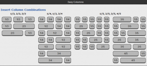
Easy Columns <– it’s a plugin for WordPress. I installed it and creating columns becomes really easy. For example if you wanted a one third column on the left and two thirds on the right you would type
[ezcol_1third]
text or image you want in the left column
[/ezcol_1third]
[ezcol_2third_end]
text or image you want in the right column
[/ezcol_2third_end]
It’s that easy, I think the plugin has built in @media calls to reshape the layout based on screen size. It’s been working great for ber10thal.com/beverage. I set my images on the left and the text on the right. In mobile it stacks and is easy to read.